Why it mattered
Story
Hypothesis
Answer the decisions that precede a purchase, rather than treating switching as one checkout funnel.
Insights
Team usability work exposed confusion around per-line pricing, discount discovery, device choices, and confidence in continuing online.
These were cross-functional concepts within T-Mobile's existing web system. The usability studies were team research; my contribution was the interaction and information-architecture direction shown here, not the research alone.
Make choices understandable before commitment
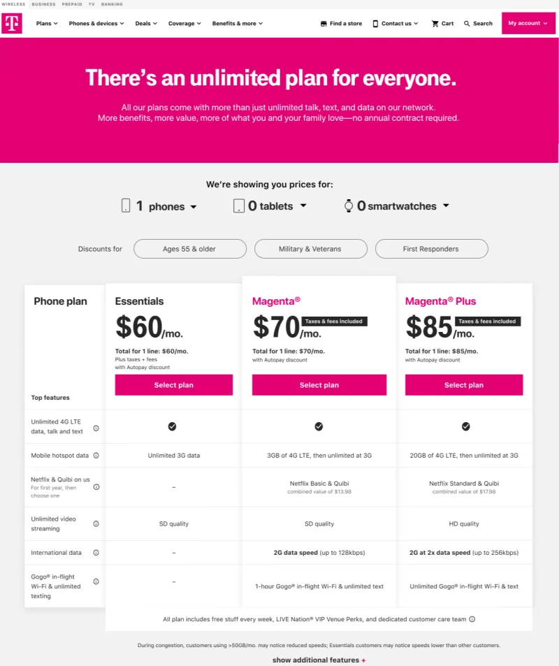
I worked on comparison and configuration states that put line count, plan pricing, and device options into the same decision path. These screenshots show interface directions, not a completed purchase funnel.
Keep routes to help visible
A customer may need a store or a conversation instead of another checkout step. The work explored a mobile store selector and a contextual chat entry alongside web purchase. The artifacts show distinct handoff concepts; they do not prove those channels were integrated into one shipped service.
Refine the details that affect confidence
The studies also identified discount discoverability and device eligibility as points of confusion. The plan and cart concepts make discount options and selected lines more explicit. The surviving record does not isolate the effect of any one revision.
The lesson is to test whether people understand the commitments around a switch, not just whether they can find a purchase button.